Rows: 124
Columns: 14
$ obs_lat     <dbl> -43.46398, -43.46257, -43.46228, -43.46207, -43.46201, -42…
$ obs_lon     <dbl> 146.8676, 146.8485, 146.8490, 146.8491, 146.8476, 146.5577…
$ date        <date> 2021-12-14, 2015-12-09, 2017-04-17, 2023-12-21, 2022-12-2…
$ time        <chr> "22:14:23", "15:00:24", "13:31:00", "14:18:00", "18:42:12"…
$ year        <dbl> 2021, 2015, 2017, 2023, 2022, 2024, 2024, 2024, 2024, 2018…
$ month       <dbl> 12, 12, 4, 12, 12, 12, 12, 12, 12, 11, 12, 12, 12, 12, 12,…
$ day         <dbl> 14, 9, 17, 21, 26, 5, 5, 5, 4, 28, 4, 5, 5, 6, 5, 4, 2, 2,…
$ hour        <int> 22, 15, 13, 14, 18, 11, 11, 11, 23, 6, 22, 16, 16, 21, 11,…
$ weekday     <ord> Tuesday, Wednesday, Monday, Thursday, Monday, Thursday, Th…
$ dayofyear   <dbl> 348, 343, 107, 355, 360, 340, 340, 340, 339, 332, 339, 340…
$ sci_name    <chr> "Arachnocampa tasmaniensis", "Arachnocampa tasmaniensis", …
$ record_type <chr> "HUMAN_OBSERVATION", "HUMAN_OBSERVATION", "HUMAN_OBSERVATI…
$ obs_state   <chr> "Tasmania", "Tasmania", "Tasmania", "Tasmania", "Tasmania"…
$ ws_id       <chr> "949610-99999", "949610-99999", "949610-99999", "949610-99…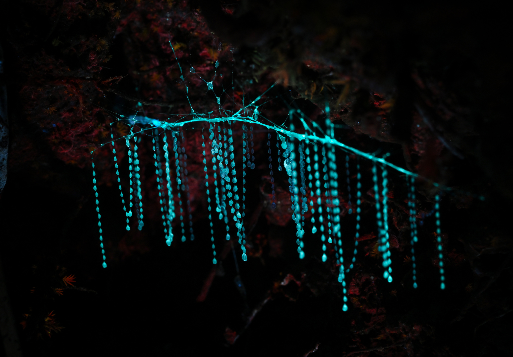
Photo by Alan Rockefeller. Licensed under CC BY 4.0.
1 Introduction
This vignette demonstrates how to analyze occurrence data for Glowworms in Australia, using records from the Atlas of Living Australia (ALA).
The dataset has been prepared for you to explore, making it suitable for both study and practice with real-world ecological data. In this vignette we provide short examples of how to manipulate and visualize the dataset, but you are encouraged to develop your own creative approaches for analysis and visualization.
This is the glimpse of your data :
2 Visualization
2.1 Spatial Distribution Map
Distribution of Occurrence Glowworms Sightings in Australia
library(ggplot2)
library(ggthemes)

glowworms |>
  ggplot() +
    geom_sf(data = oz_lga) +
    geom_point(aes(x = obs_lon, y = obs_lat), color = "red") +
    theme_map()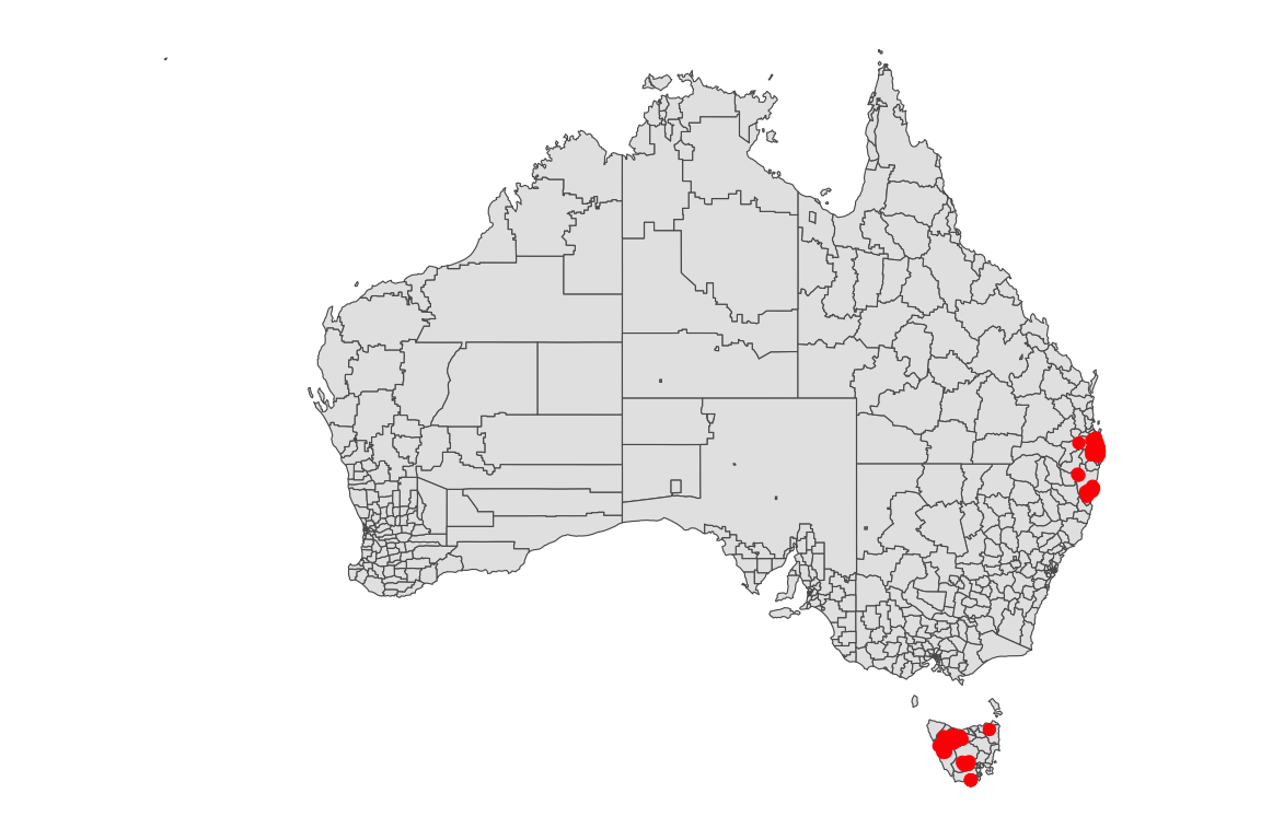
3 Weekly, Monthly, and Yearly Trends
Weekday Distribution of Glowworms Sightings
week_order <- c("Monday", "Tuesday", "Wednesday", "Thursday", "Friday", "Saturday", "Sunday")

glowworms |>
  ggplot(aes(x = factor(weekday, levels = week_order))) +
    geom_bar() +
    labs(x = "Weekday", y = "Number of Records") +
    theme_minimal()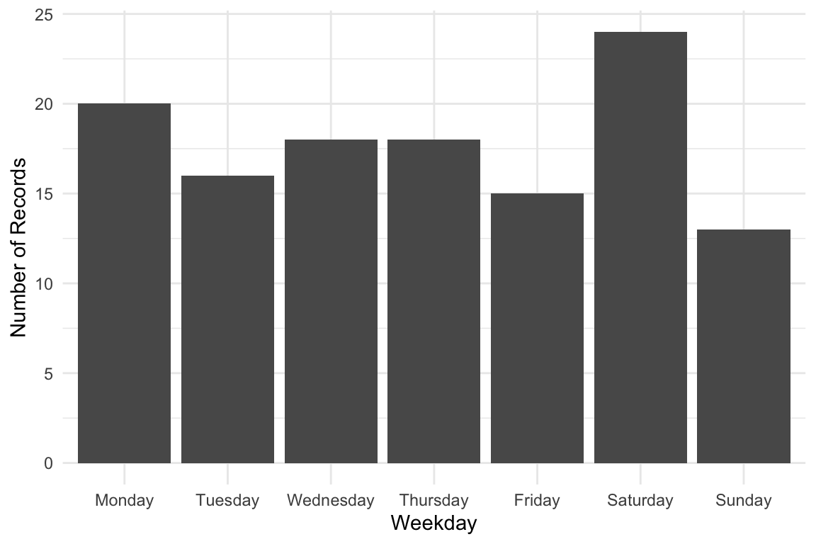
Monthly Distribution of Glowworms Sightings
library(lubridate)
glowworms |>
    dplyr::mutate(month = month(month, label = TRUE, abbr = TRUE)) |>
    ggplot(aes(x = factor(month))) +
    geom_bar() +
    labs(x = "Month", y = "Number of Records") +
    theme_minimal()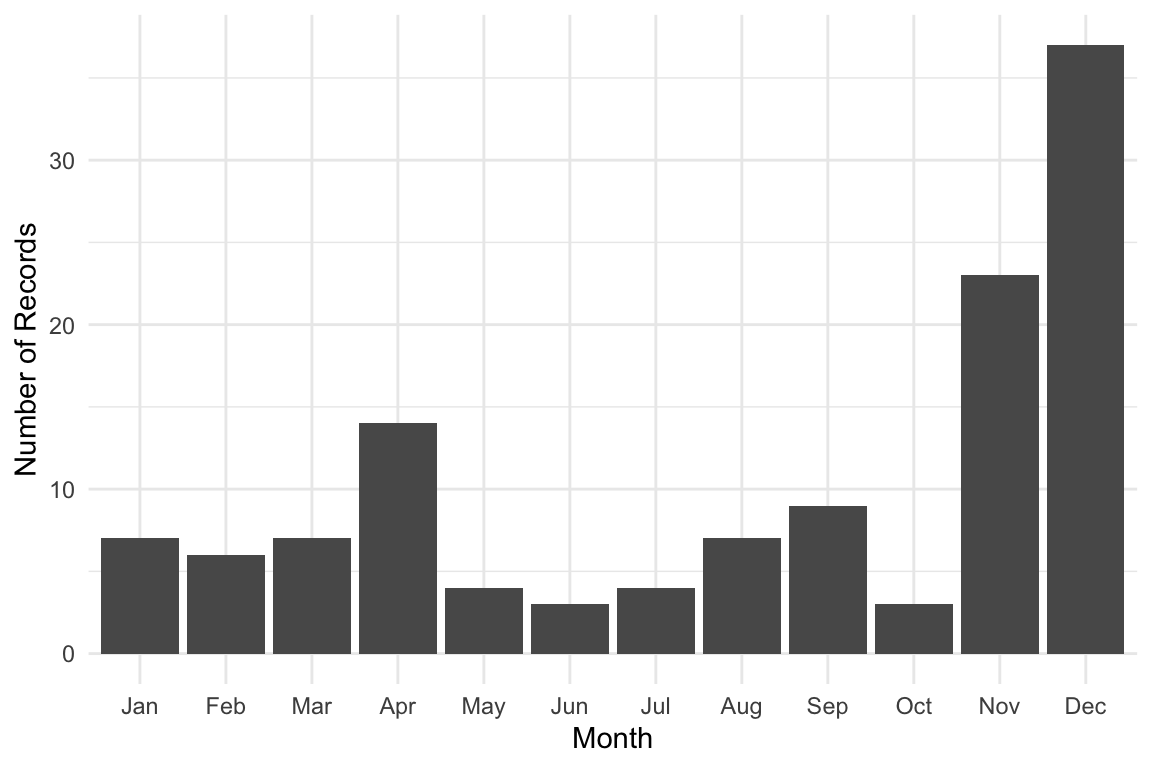
Yearly Distribution of Glowworms Sightings
glowworms |>
    ggplot(aes(x = factor(year))) +
    geom_bar() +
    labs(x = "Year", y = "Number of Records")+
    theme_minimal()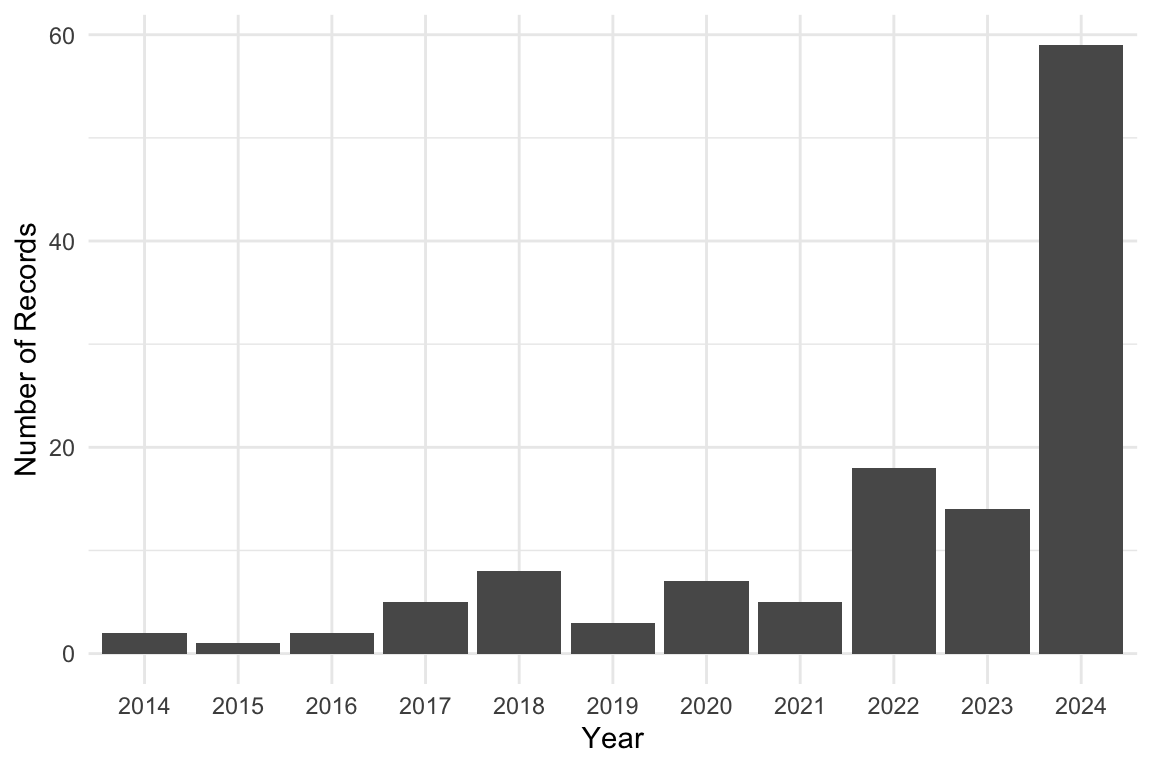
4 Relational visualization
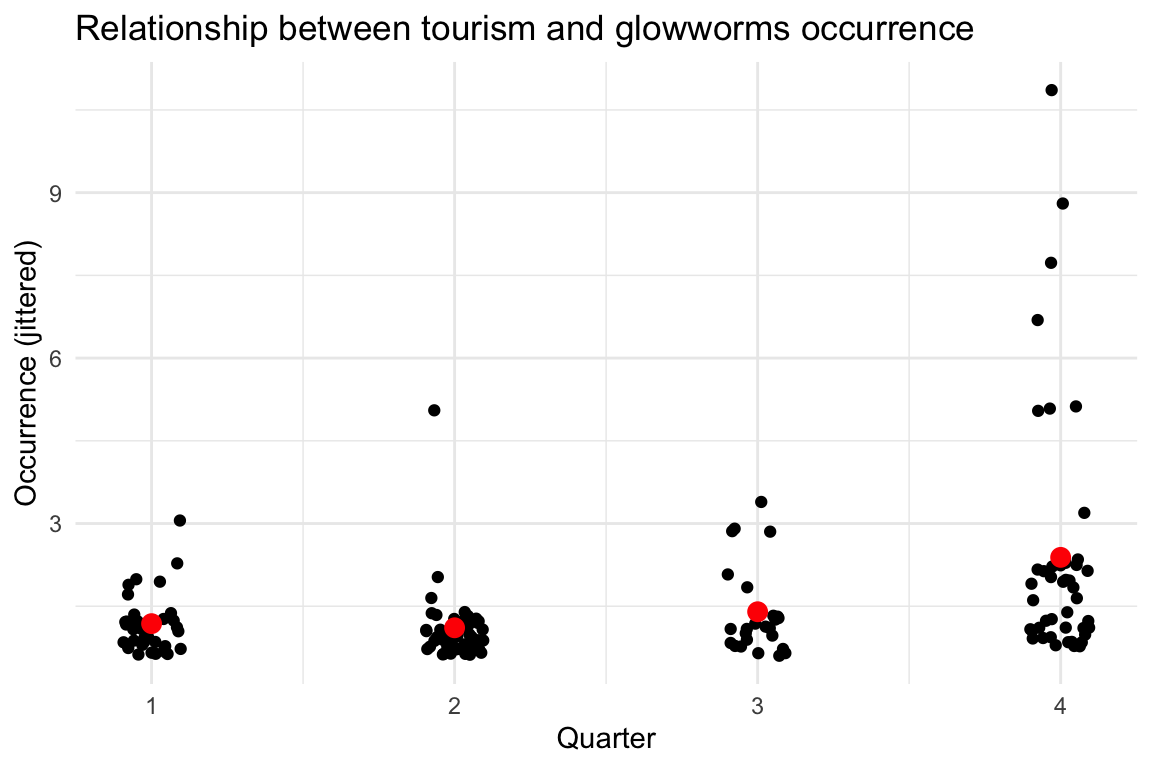
We want to see if glowworms occurrences are related to tourism quarter trips on the same day from the weather dataset.
Here’s a short R script that:
Joins
glowwormswith weather usingws_idanddate.Counts daily occurrences.
Plots quarter number of
glowwormssightings.
# Prepare glowworms occurrence counts per quarter
glowworms_quarterly <- glowworms |>
  mutate(quarter = quarter(date)) |>
  group_by(year, quarter, ws_id) |>
  summarise(occurrence = n(), .groups = "drop")

# tourism quarterly spot data set near glowworms occurrence
tourism_sub <- tourism_quarterly |>
   filter(ws_id %in% glowworms$ws_id)

glowworms_tourism <- glowworms_quarterly |>
  left_join(tourism_sub, by=c("ws_id", "year", "quarter"))

# Simple scatter plot: precipitation vs glowworms occurrence
ggplot(glowworms_tourism, aes(x = quarter, y = occurrence)) +
  geom_jitter(width=0.1) +
  stat_summary(colour="red", geom = "point", size=3) +
  labs(
    title = "Relationship between tourism and glowworms occurrence",
    x = "Quarter",
    y = "Occurrence (jittered)"
  ) +
  theme_minimal()