Rows: 35,052
Columns: 14
$ obs_lat     <dbl> -35.20000, -35.20000, -35.20000, -35.20000, -35.20000, -35…
$ obs_lon     <dbl> 117.8000, 118.0000, 116.7000, 117.7000, 117.6000, 117.8073…
$ date        <date> 2017-09-11, 2019-08-02, 2016-10-06, 2017-09-07, 2022-08-0…
$ time        <chr> "18:08:00", "12:38:00", "17:32:00", "09:30:00", "09:21:09"…
$ year        <dbl> 2017, 2019, 2016, 2017, 2022, 2024, 2024, 2021, 2024, 2016…
$ month       <dbl> 9, 8, 10, 9, 8, 9, 8, 9, 10, 10, 9, 10, 9, 4, 10, 10, 7, 9…
$ day         <dbl> 11, 2, 6, 7, 6, 18, 23, 23, 19, 3, 30, 23, 25, 10, 9, 4, 3…
$ hour        <int> 18, 12, 17, 9, 9, 10, 9, 16, 11, 14, 13, 12, 12, 16, 16, 1…
$ weekday     <ord> Monday, Friday, Thursday, Thursday, Saturday, Wednesday, F…
$ dayofyear   <dbl> 254, 214, 280, 250, 218, 262, 236, 266, 293, 277, 273, 297…
$ sci_name    <chr> "Pterostylis heberlei", "Corybas limpidus", "Caladenia int…
$ record_type <chr> "HUMAN_OBSERVATION", "HUMAN_OBSERVATION", "HUMAN_OBSERVATI…
$ obs_state   <chr> "Western Australia", "Western Australia", "Western Austral…
$ ws_id       <chr> "948010-99999", "948010-99999", "956470-99999", "948010-99…
Orchids, Photo taken by Lyn Cook.
1 Introduction
This vignette demonstrates how to analyze occurrence data for Orchids in Australia, using records from the Atlas of Living Australia (ALA).
The dataset has been prepared for you to explore, making it suitable for both study and practice with real-world ecological data. In this vignette we provide short examples of how to manipulate and visualize the dataset, but you are encouraged to develop your own creative approaches for analysis and visualization.
This is the glimpse of your data :
2 Visualization
2.1 Spatial Distribution Map
Distribution of Occurrence Orchids Sightings in Australia
library(ggplot2)
library(ggthemes)

orchids |>
  ggplot() +
    geom_sf(data = oz_lga) +
    geom_point(
      aes(x = obs_lon, y = obs_lat), color = "red", alpha = 0.5, size = 0.3) +
    theme_map()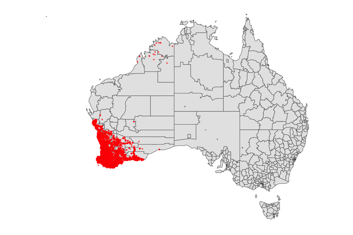
3 Weekly, Monthly, and Yearly Trends
Weekday Distribution of Orchids Sightings
week_order <- c("Monday", "Tuesday", "Wednesday", "Thursday", "Friday", "Saturday", "Sunday")

orchids |>
  ggplot(aes(x = factor(weekday, levels = week_order))) +
    geom_bar() +
    labs(x = "Weekday", y = "Number of Records") +
    theme_minimal()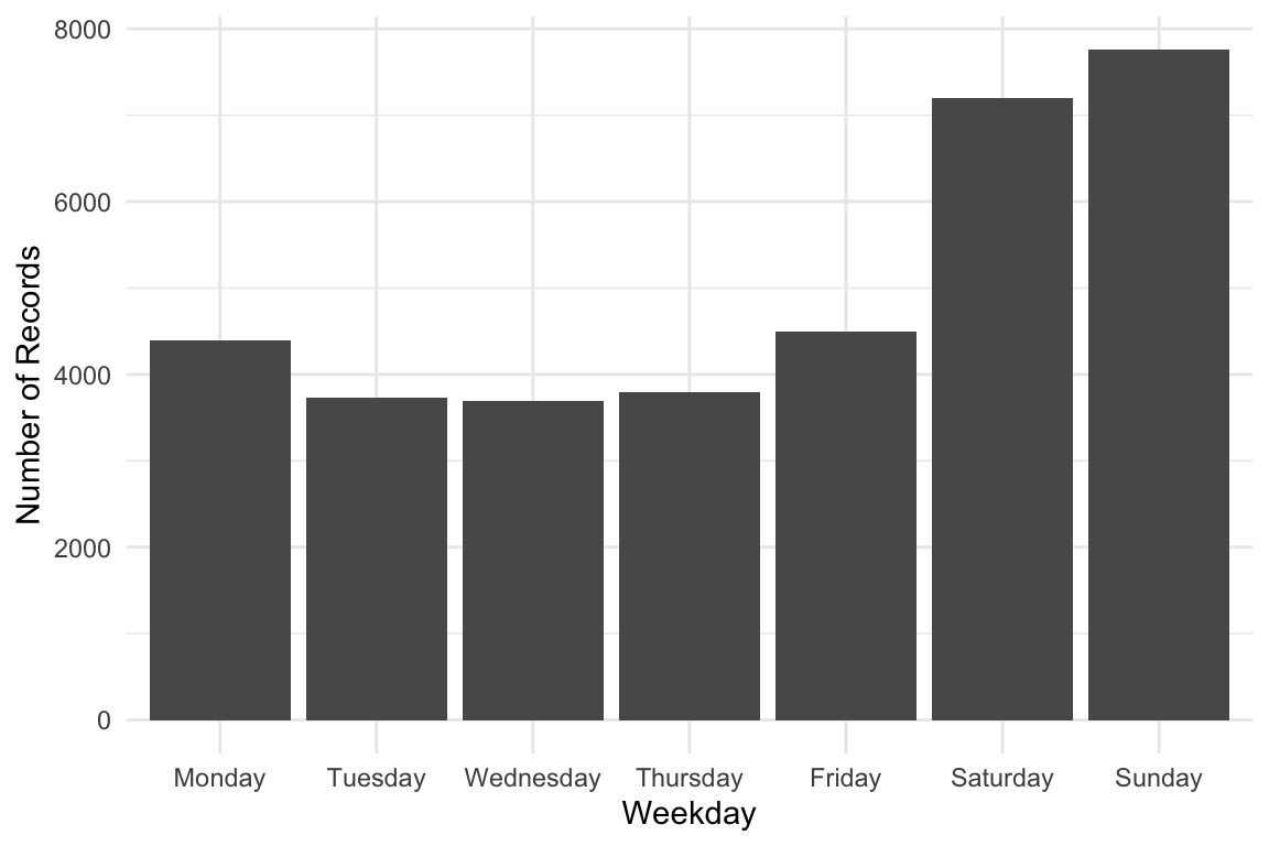
Monthly Distribution of Orchids Sightings
library(lubridate)

orchids |>
    dplyr::mutate(month = month(month, label = TRUE, abbr = TRUE)) |>
    ggplot(aes(x = factor(month))) +
    geom_bar() +
    labs(x = "Month", y = "Number of Records") +
    theme_minimal()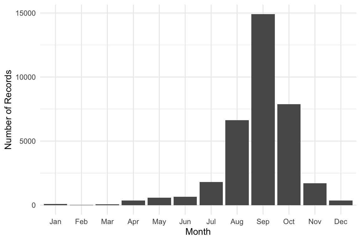
Yearly Distribution of Orchids Sightings
orchids |>
    ggplot(aes(x = factor(year))) +
    geom_bar() +
    labs(x = "Year", y = "Number of Records") +
    theme_minimal()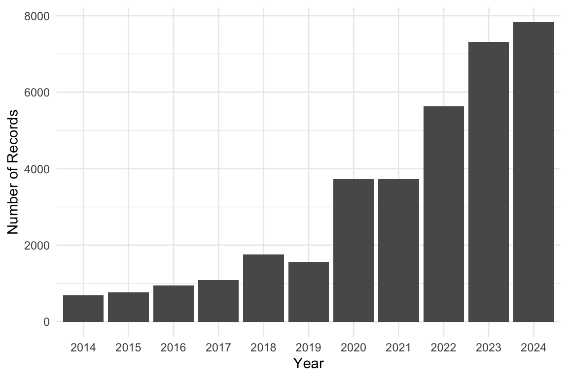
4 Relational visualization
We want to see if orchids occurrences are related to precipitation on the same day from the weather dataset.
Here’s a short R script that:
Joins
orchidswith weather usingws_idanddate.Counts daily occurrences.
Plots precipitation vs number of
orchidssightings.
library(ggbeeswarm)

# Prepare orchids occurrence counts per day
orchids_daily <- orchids |>
  group_by(ws_id, date) |>
  summarise(occurrence = n(), .groups = "drop")

# Join with weather data for precipitation
orchids_weather <- orchids_daily |>
  left_join(weather |> select(ws_id, date, prcp),
            by = c("ws_id", "date"))

orchids_weather |>
  filter(!is.na(prcp)) |>
  mutate(rain = if_else(prcp > 5, "yes", "no")) |>
  ggplot(aes(x = rain, y = occurrence)) +
  geom_quasirandom(alpha = 0.6) +
  ylim(c(0, 15)) +
  labs(
    title = "Relationship between rainy day and orchids occurrence",
    x = "Rainy",
    y = "Number of orchids records"
  ) +
  theme_minimal()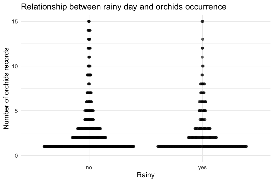
orchids_weather <- orchids_daily |>
left_join(
weather |> select(ws_id, date, temp, prcp),
by = c("ws_id", "date")
)
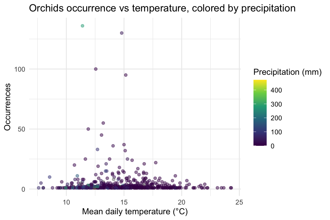
ggplot(orchids_weather, aes(temp, occurrence, color = prcp)) +
geom_point(alpha = 0.5) +
scale_color_viridis_c() +
labs(
title = "Orchids occurrence vs temperature, colored by precipitation",
x = "Mean daily temperature (°C)",
y = "Occurrences",
color = "Precipitation (mm)"
) +
theme_minimal()